Driving AI with no dashboard!
See waste, save cost, and keep answers fast—without reading your messages. Built for developers, tech managers, and leadership.

The simple story
When the first cars were imagined, they didn’t have dashboards. No speed dial, no fuel gauge, no warning lights—just a wheel and hope. Drivers ran out of fuel, overheated engines, and guessed their speed. That’s how most teams run AI today: the car moves, but no one can see what it’s costing, what’s being wasted, or when something is about to go wrong.
DoCoreAI is the dashboard and friendly co‑pilot for your AI. It shows how much “fuel” your AI is burning (tokens & efficiency), how fast answers arrive (controlled sampling), where waste creeps in, and it nudges you with simple fixes—without reading your private conversations.
Example: The Support Team That Ran Out of Fuel
BrightHelp, a small software company, added an AI helper for common questions. It worked, but replies felt long, bills kept rising, and no one knew why. With DoCoreAI, the Fuel Gauge spiked: a third of their words were polite fluff and repeated policy lines. The co‑pilot tip suggested shortening the greeting and capping answer length. The next week, replies were about 30% shorter, costs dropped, and customers got faster answers—same clarity, less waste.
Three clear views of the road
For Developers — The Driver’s View
See where words pile up, what feels slow, and which prompts break. Get simple nudges that make answers shorter, clearer, and cheaper. Learn the signals in Prompt Analytics for Developers.
For Tech Managers — The Crew Chief’s View (team lead)
Spot the workflows that burn fuel, set sensible “speed limits” (length caps, mode per task), catch brittleness early, and repeat wins across the team. See the LLM Cost Analytics Dashboard.
For the Organization — The Fleet Owner’s View (company view)
See spend per task and product, keep reliability high, and set simple rules that don’t slow the team. Explore DoCoreAI Features or jump to the sample dashboard.
The gauges (and what they mean)
| Gauge | Developer Driver |
Tech Manager Crew Chief |
Organization Fleet Owner |
|---|---|---|---|
| Fuel (Tokens) | Where my words pile up. | Which workflows are expensive. | Cost per task / product trend. |
| Speed (Time to Answer) | Why this feels slow. | Response-time risks and hotspots. | Experience consistency across teams. |
| Warning Lights (Failures) | Which prompt broke. | Where things break easily. | Keep problems away from customers. |
| Cost per task, month by month | Before/after on a change. | Impact of a standard team‑wide. | Unit economics, month over month. |
| Co‑Pilot Tips (Simple Fixes) | Trim greeting, cap length, mode fit. | Roll winning patterns team‑wide. | Savings that recur, not one‑offs. |
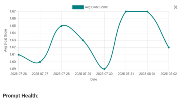
Curious how we score consistency and waste? Learn about Prompt Health, or the metrics dashboard tailored for managers.
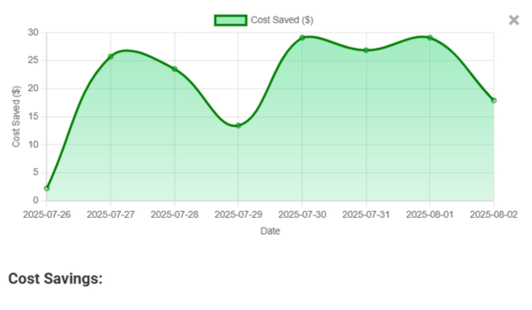
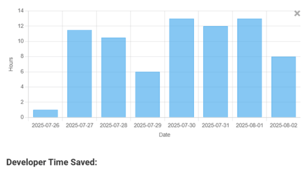
What you’ll see at a glance


Another quick example: Sales replies without the fluff
A startup used AI to draft first‑reply emails. DoCoreAI showed most cost came from long sign‑offs and repeated disclaimers. The co‑pilot tip suggested one‑line sign‑offs and a short intro. They kept the tone, cut the fluff, and saved a chunk of budget each week—while getting replies sooner.